Scatter Plots with ggplot() in R
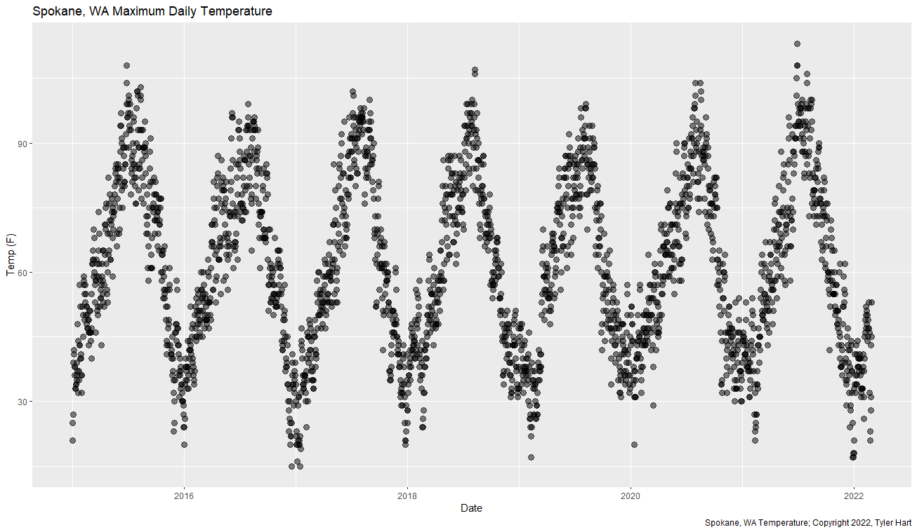
We can create great scatter plots easily in R with ggplot() and geom_point(). I've downloaded climate data for my hometown from the US NOAA and we'll use that to make a scatter plot showing temperature over time. You can get a copy of the data here if you want to follow along. Here's what it will look like when we're finished:
First, load up the tidyverse and readr libraries in R:
    library(tidyverse)
    library(readr)
Second, import data from the temperature.csv file with read_csv():
    temperature <- read_csv(
        "temperature.csv",
        col_types = cols(DATE = col_date(format = "%m/%d/%Y"))
        )
This assumes that the temperature.csv file is in your working directory. Finally, pipe the temperature data frame into ggplot() and add a geom_point() layer:
    temperature %>%
        ggplot(aes(DATE, TMAX)) +
        geom_point()
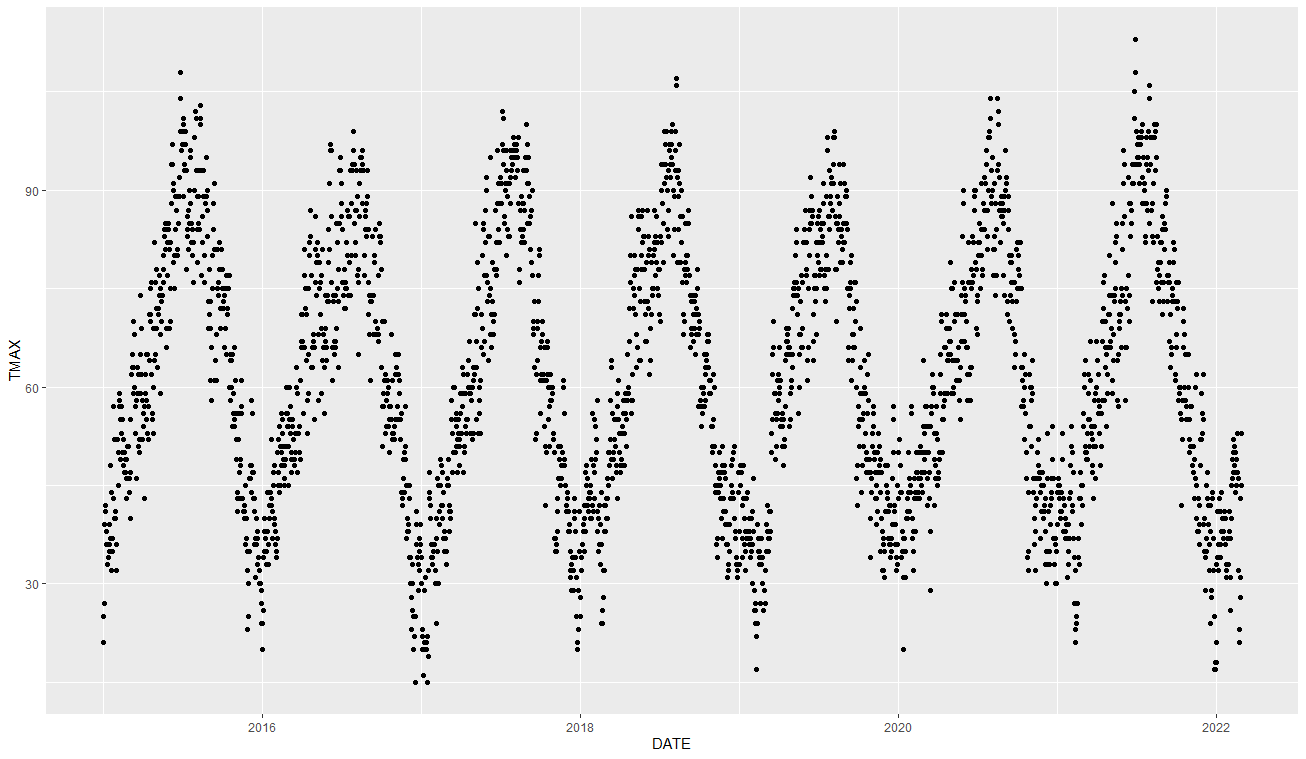
That produces a basic scatter plot using our temperature data. Here’s how it looks at the moment:
Basic ggplot() scatter plot
We wouldn’t want to put this in a report though - the axis aren’t labelled nicely, there’s no title, no caption, and we can make the points look better. Adding some formatting and labelling information goes a long way - let’s add those now:
temperature %>%
    ggplot(aes(DATE, TMAX)) +
    geom_point(alpha = 0.5, size = 3) +
    labs(
        x = "Date",
        y = "Temp (F)",
        title = "Spokane, WA Maximum Daily Temperature",
        caption = "Your awesome caption here"
    )
Now we have a scatter plot we can feel good about sharing around. The size option in geom_point() makes the dots a bit bigger so they’re easier to see, while the alpha option adds some transparency. Better labels on the X-axis and Y-axis make the visualization easier to consume, and the title and caption are professional touches.
I hope this was helpful for folks building scatter plots in R. Please let me know what you think!

