Scatter Plots in Power BI
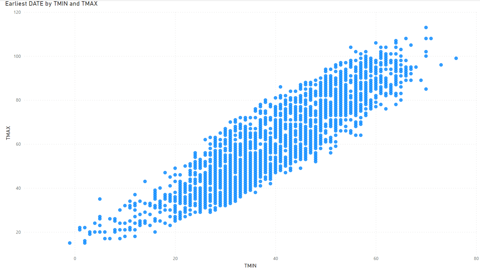
It’s easy to create a scatter plot in Power BI. We’ll leverage our trusty NOAA temperature data again, the same we used when doing a scatter plot in R with ggplot(). In just a couple minutes we can see at-a-glance the relationship between low and high temperature each day. Here’s how it will look:
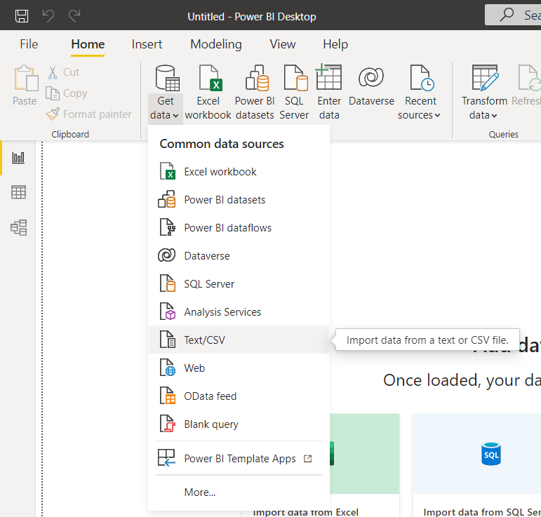
We can use the same temperature data that was used in the Scatter Plots in R article. First, open up Microsoft Power BI. Next, click the “Get data” button and select “Text/CSV”:
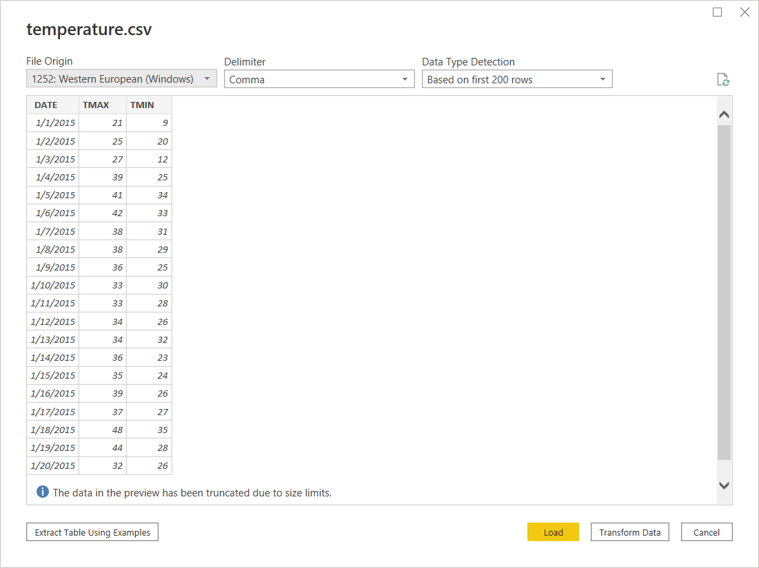
Select the temperature CSV file downloaded already. The load data window will show all three columns, including the properly-formatted date column.
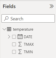
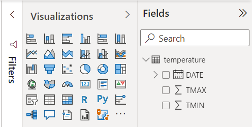
Click the “Load” button. The new data will appear to the right under the “Fields” header.
In the Visualization pane, double-click the “Scatter chart” button or right-click and drag it to the canvas.
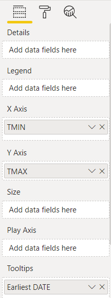
The scatter chart is the icon in the third row with multiple, spread-out boxes. Let’s investigate the relationship between minimum and maximum temperatures. Drag TMIN to the X-axis and TMAX to the Y-axis. We can also drag DATE to the Tooltips area so when we hover over a plotted point we’ll see the date.
Let’s look at the visualization that shows the intersection between low and high temperature:
